Creation Of an Edu-Brochure Website for A Reputed IT Institute with A Primary Focus on Courses and Curriculum
Services
- Planning & Consulting
- Information Architecture
- UI/UX Design
- Custom Web Development
- Continuous upgradation
- 24x7 Maintenance and Support
About
Affluenz IT Academy is not just any IT academy and it is not even a conventional educational institute because it is more of an institute in the shape of an ecosystem that nurtures talent and helps build an environment of focused knowledge. They are one of a kind when it comes to institutes because they work with everyone from IT practitioners to data scientists, CTOs and even former students to create knowledge that can be shared and available to everyone.
Background
The background behind our working together is also quite simple and straightforward and it all began when Affluenz IT Academy was looking for a web design and development company that understood its needs to showcase the various courses it provides. That is how we came into the picture.
The Challenge
The challenge behind this project was to create a website that would act as a digital brochure for prospective students trying to find the best IT courses. The project dictated that we create a website that not only reflected IT but also had all the course details at the centre point of focus which can be accessed quite simply through one or two clicks. We definitely had to make sure that the design language was alright for our clients
The Solution
The solution that we provided was a game changer because it was not only the perfect representation of an IT institute but it was also relatively simple in operation. We had to keep in mind that this website is primarily for students and especially students looking for an IT course.
That is why we made sure that even if the banner did occupy a lot of space, the CTA button for the courses was present at a very convenient access point just below it. If you look at this picture from our initial planning stage then you can understand our thought behind it.
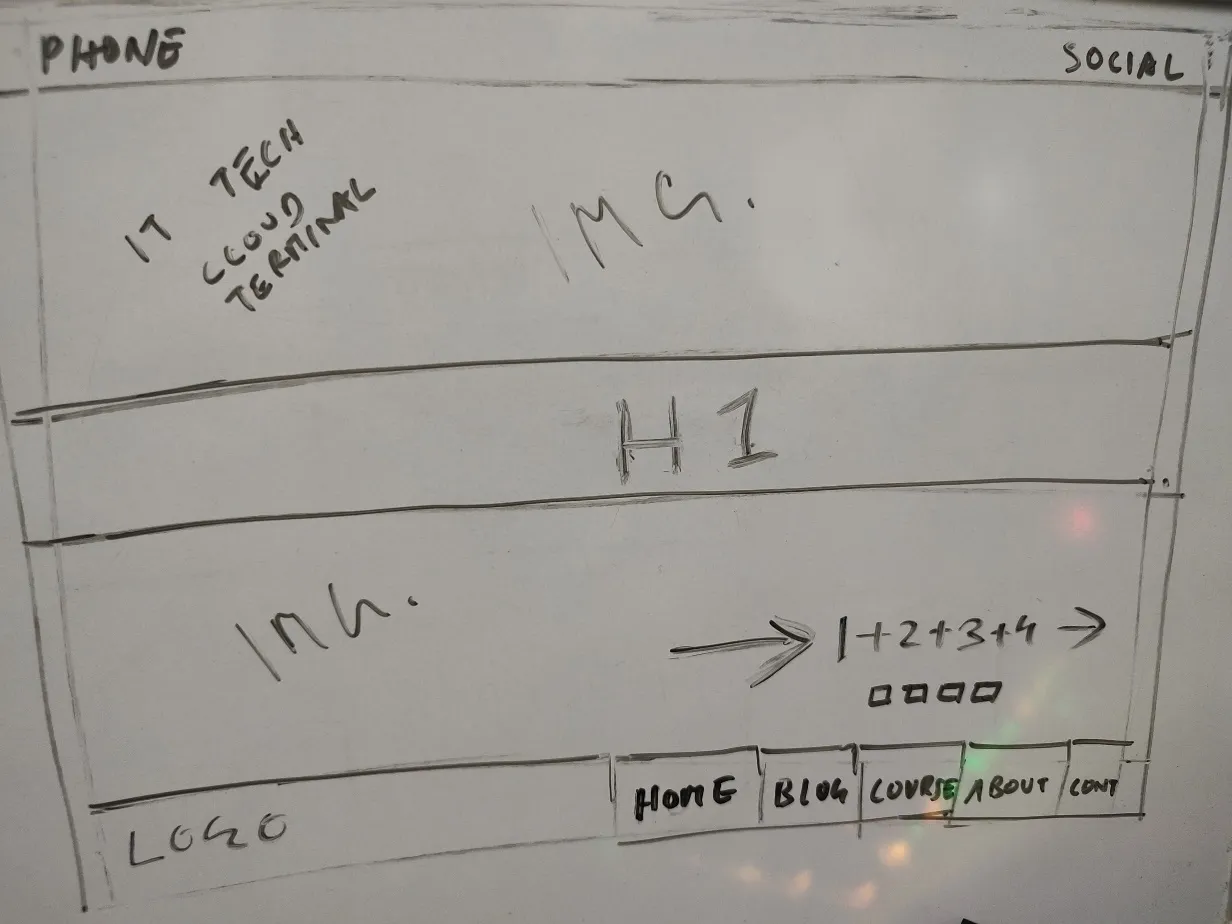
Concept Design
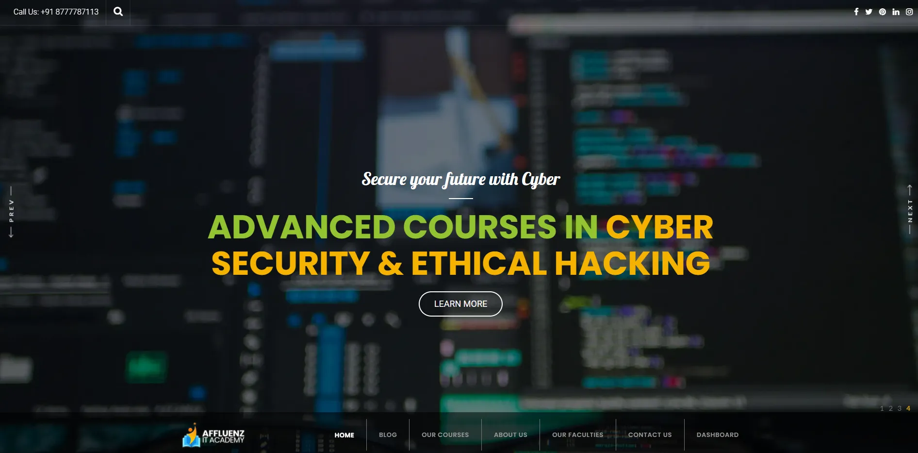
Final Design
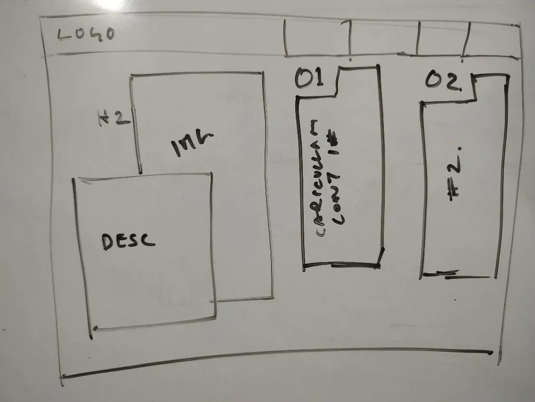
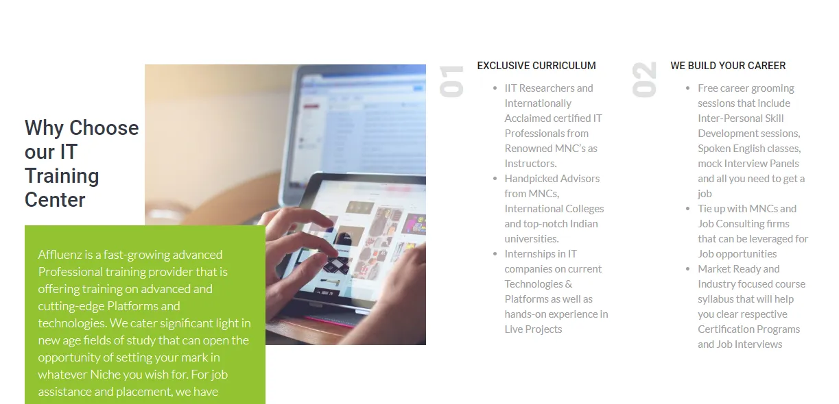
It is important for a brand to showcase its USPs and there should be a dedicated section for it and that is exactly what we needed for this website apart from the pages with the courses.
This section about important figures and achievements definitely needed a place of its own and in order to do that we made sure the layout was the simplest grid known to mankind.
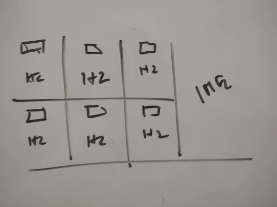
Concept Design
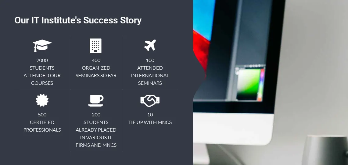
Final Design
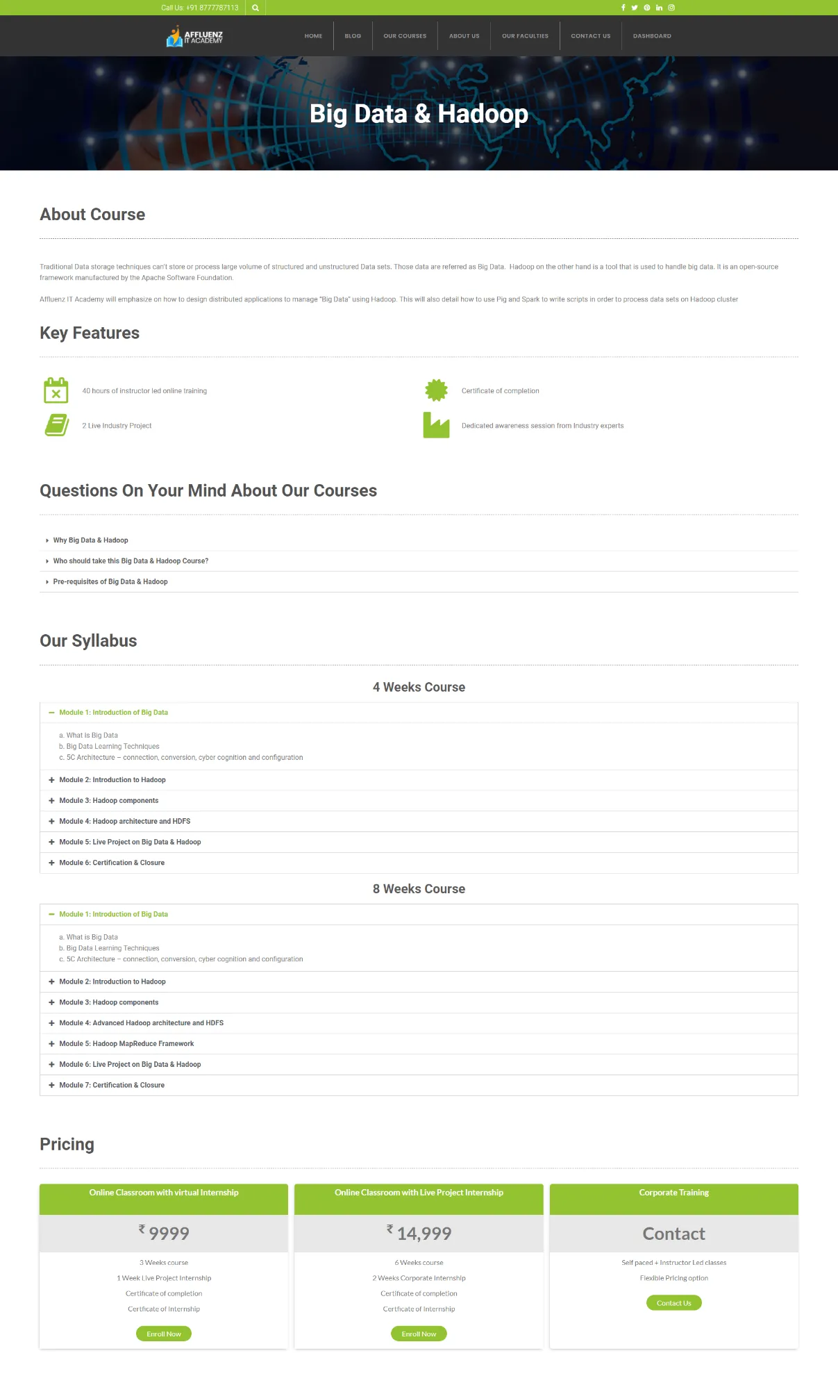
Finally, we need to talk about the most important pages on this website and we are of course talking about the pages with the courses. That is why we came up with a structure that is simple to understand for students.
The course pages are going to start with a simple Introduction about the course followed by Features and Important Questions regarding the course followed by the Syllabus and finally the Pricing.
Results
- A permanent place for students to come and have a look at important course details so that they can now make a consistent choice for their education.
- A robust website that is scalable and versatile, that can be utilised to further the goals of the IT institute.
- A solid digital footprint that is generating relevant leads for the business.

